Julie Herman: Negative Space, Color & My Design Process
Our Guest Blogger series kicks off today with Julie Herman of Jaybird Quilts pattern company.
Hey Lazies!!
It’s Julie of Jaybird Quilts!
Some background for those of you who don’t know me.
A born artist, I’ve been creating for as long as I can remember. I attended Drexel University and studied design and focused in fine arts. In 2002 I borrowed my mother’s sewing machine and never turned back. Through books and magazines I taught myself how to quilt. The path I took was much less traditional than most. Since I did not have any quilters in my life to guide me I often worked from instinct. When things didn’t work I took it as a lesson learned and kept on going. This eventually led me to start my blog and design my own quilt patterns.
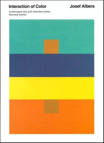
During college I had to purchase many books for classes. Most I have since passed along to others but a few remain permanently in my library. The first is Interaction of Color Unabridged Text & Selected Plates by Josef Albers. This book is considered by many to be one of the most influential books on color theory.
Color Theory
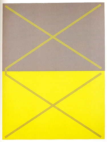
In this print below from Interaction of Color the top X appears yellow inside the gray and the bottom X appears gray inside the yellow. If we look closely where the X’s meet at the middle left, we see that both X shapes are actually the same color. The book goes into detail on how every color is affected by the colors around it.
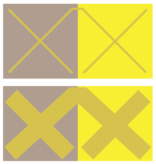
In this version that I made, inspired by the one above, you can see how the weight of the lines diminishes the effect one color has on another. One part of your brain tells you that it is the same color, while another part of your brain still process it as two!
I could go on for days & days about color! Many quilters are afraid of color and the fabric selection process. My #1 piece of advice would be to try anything & everything. You’ll learn from your mistakes and your confidence will grow along the way. If you are unsure about a certain color choice make a sample block or two. Attach them to the wall and take a few steps back. You’ll see the interaction of the colors in a new light!
Negative Space
Negative Space is often a foreign concept to people that do not have formal art training. When cutting out a paper doll, the doll is the positive and the paper that falls away is the negative. It’s very much a right brain/left brain thing and deals with how our brain perceives things.
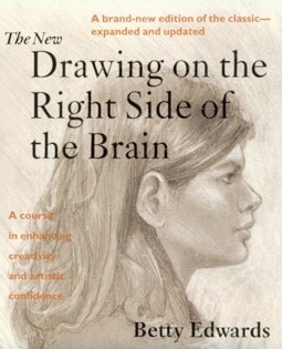
After finishing my bachelor’s in design I got my master’s in education. My original intent was to be an elementary school art teacher. One of the courses I took was directed at educating non-artistic people on how artistic people learn. For the class we used many books but one will forever stick out to me. Drawing on the Right Side of the Brain – Betty Edwards. The book has many exercises that help to understand how the Right and Left sides of our brain work. For anyone who wants to learn a lot more about negative space I highly suggest the book. You can also try out the faces/vase exercise online. http://drawright.com/vaceface.htm
Negative Space in Quilts
To make my quilts pop I’ve recently been using solid white & solid black as my contrast fabrics. While my choices are at the opposite values they both serve the same purpose of high contrast from the other fabrics I’ve selected. I especially enjoy playing with negative space in the design of my quilts. Almost all of my quilt designs do not use sashing, which therefore allows the blocks to flow into one another. The secondary shapes created by the background fabric flowing together where the blocks meet are often more interesting than the blocks themselves.
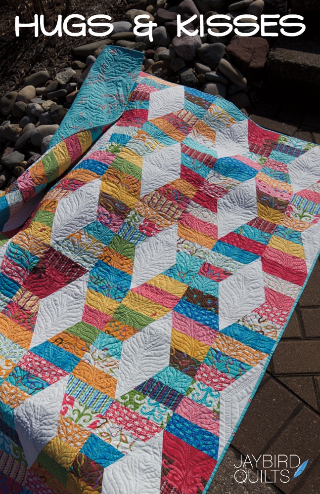
In Hugs & Kisses for example the diamonds are the strongest shape, but they are created from parts of multiple blocks.
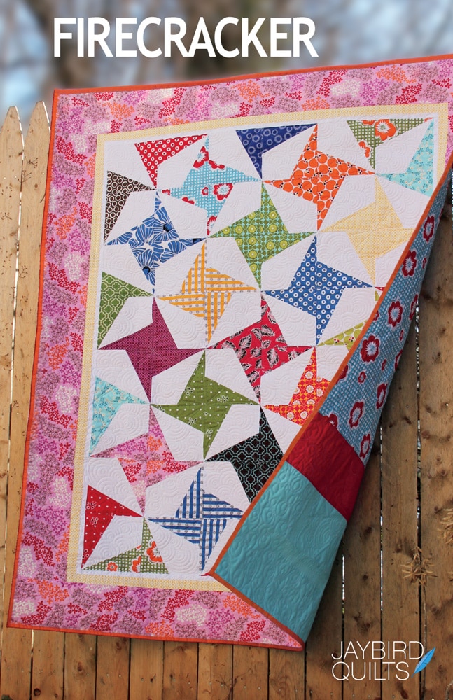
The negative spaces in Firecracker are stretched diamonds.
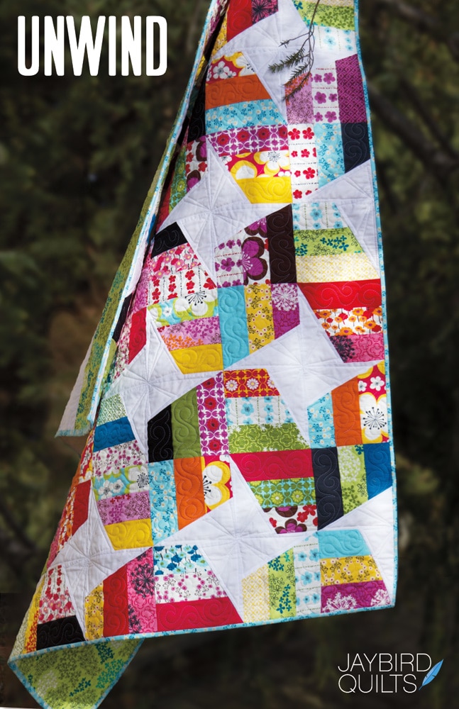
The negative space in Unwind becomes the positive space be creating stars.
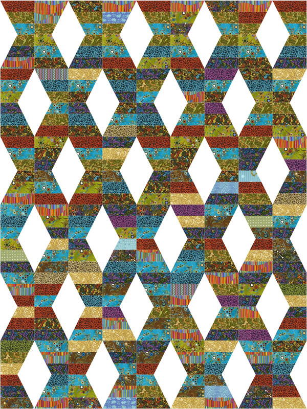
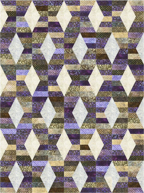
The negative spaces in Carnival look like hourglasses.

Color Affects Negative/Positive
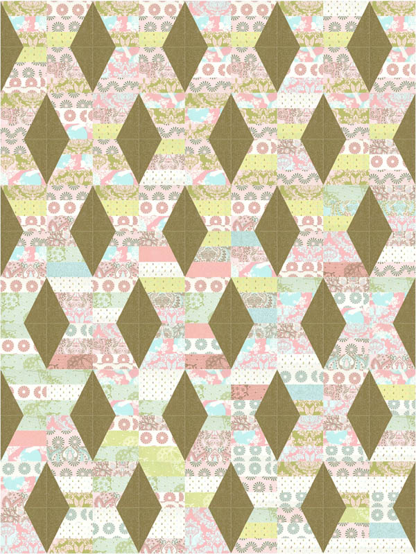
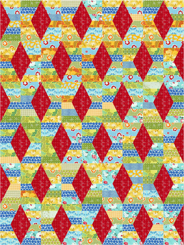
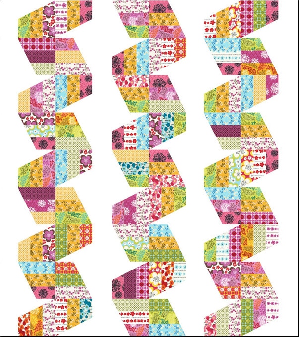
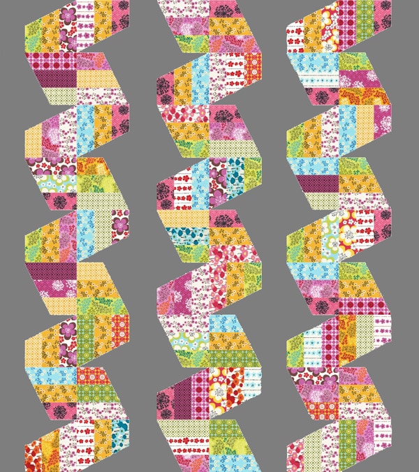
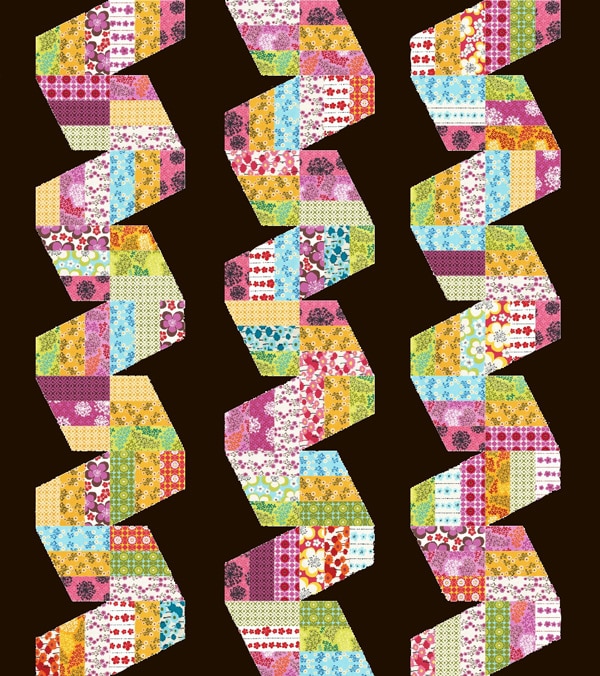
Color can change what you view as the negative space vs. the positive. The digital images below show a few possibilities with my Hugs & Kisses Pattern.
Drama of Bold Colors
Below, similar to cover quilt with bold colors and white diamonds.
Pieced Fabrics With Similar Value
The brown diamonds fade to the background and the light pieced strips are an even stronger design element since there is not much value change with the fabrics.
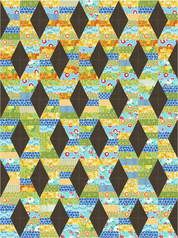
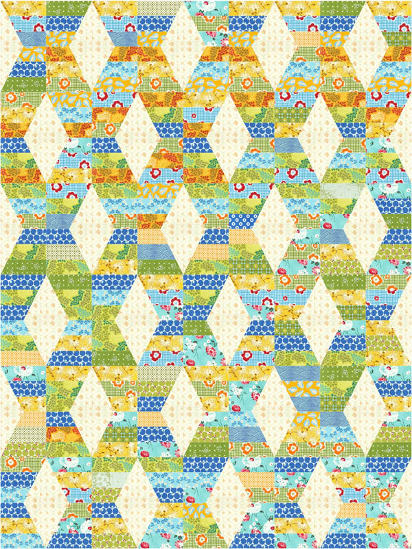
Different Background Options
The following three show how the same fabrics for the pieced strips can look very different with red, dark and light background options.
Batiks – The diamonds are still visible but blend more with the pieced strips.
Similar things will occur with all of my patterns. Here are 3 versions of Fast Forward using the same colors for the strips. Look how different white, gray, or dark background changes the quilt!
Whether you use solids or prints, I encourage you to try out background fabrics that are not what you would consider your usual go-to colors. Try something that is a bit uncomfortable and you may be surprised at the results. Most importantly HAVE FUN!
– Julie
Join Julie at:
Her blog: http://www.jaybirdquilts.com/
Facebook: http://www.facebook.com/home.php?#!/pages/jaybird-quilts/289369766249
Purchase patterns: http://www.jaybirdquilts.com/p/where-to-buy-my-patterns.html
Books:
Interaction of Color: Revised and Expanded Edition
The New Drawing on the Right Side of the Brain
Michael Update – My hubster Michael had a very successful surgery Friday morning. The procedure to remove two discs in his neck and fuse three vertebrae was uneventful. He’s at home and doing very well. Thanks for your thoughts, well-wishes, and prayers.
Thanks Julie!
Joan


as an “old girl” that can never stay IN the BOX…. i find
this fascinating… i’m committed to using up an over 15 year
STASH… and love to pick colors that “work” and then use them with
a solid…. this will work super for me…. will have to check out
your patterns… bj
Excellent mini-course on color theory and negative space. When I first happened upon Julie’s blog, I immediately realized that this young lady possessed amazing talent! I adore Julie’s patterns. It’s amusing to me to now discover that the many times I had admired the cover of “Unwind,” I had never before seen the stars in the negative space. I was amazed to “watch” them magically materialize after Julie pointed out this design feature in the pattern. I wish Julie continued success! I consider myself a fan.
I have a 15 year stash a Barbare said and have been making crazy quilt for charity. Am getting bored ut am TERRIFIED of colour. So I just do scrap so I don’t have to think. This is a fabulous article and will make me really think about my next quilt. I ure have enough solid as well as prints and have “saved the solids” for backing.
Thanks
I am a beginner and I am terrified of color, picking & choosing color for a quilt, I have Joans lazy angle ruler and I am reading her book. I cant wait to get started. I am on a limited income, so I will have to wait to get fabric. Hopefully by the 1st of the month I will know what I am doing. LOL!!! Thanks for the info, I enjoyed reading thisblog.
Linda King
Love all this info. I’m always fascinated to see the same quilt done in different colors and how striking the right color choices are. I’m definitely going to check my library for those books – that’s for the great resources!
I love “Drawing on the Right Side of the Brain” and the
exercises it contains. It is geared toward training your brain to
bring out the artistic (right) side, especially for those who are
very left-brained. Everyone is born with artistic talents, you just
need to train your brain to tap into them.
Wonderful information. I am not afraid of color but always
stay too conformed. This article motivates me to try something
totally un-me. Thanks for expanding my horizons! I have a pattern
in mind so it will be fun to select the components. The books sound
like “must haves” and am anxious to visit your website.
Carolyn
Glad to hear that someone else is passionate about color! I
have an Albers book on color as well as the “Right Side” book that
I found while studying art and design at the age of 48! So much to
do!
Thanks you so much Julie AND Joan!! I”ve not learned much
about Art in my life so I always seem to enjoy reading these type
of posts. What an incredible adventure Julie….thanks for sharing.
Joan…love your new ruler paired with Julie’s designs….great job
ladies. Smiles, Kelly
Excellent tutorial on color and negative design. I thought I’d seen most of your hidden wonders and then out pops the hourglasses in Carnival!
Wow, what a great overview on how colours and negative designs work. I have been quilting for 25+ years and found this very informative.
Fantastic post Julie … you’re so clear when you write
about colour theory, not easy, I know!
Great stuff to think about when choosing colors. Thanks
Julie!
Really enjoyed this Julie! what a great teacher you
are!!
Thank you so much for this great post! Gave me loads to think about 😉
Very interesting topic! thanks for sharing with all of us some insight into how you design.
What great illustrations for the difference a color makes! thanks so much.. going to have
to get bold in my color choices and step out of my comfort zone!
just discovered blog …. really enjoyed the subject and pictures. Thanks for putting them on the web.